New Colt 1911 colt stamp... ugly?

Status
Not open for further replies.
Joined
Jun 14, 2013
Messages
89
Location
Williamsport, Pennsylvania
Hey guys. I've been looking around at Colt 1911s in my local gunshops here and I've noticed something.

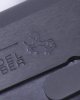
The colt on Series 70 repros seem to be.. emaciated. Very skinny, and almost cartoonish. Is this the normal marking for new Colts? It seems that whenever I see the Colt logo elsewhere the colt is very stately and elegant looking. These markings seem, well, silly. Check it out.
 

Attachments

  • Colt Logo.jpg
    Colt Logo.jpg
    35.7 KB · Views: 263
I agree; does look a wimpyish compared to some of the older Rampant Colts. Maybe a little too much fiber in the diet?
 
Look back over the years and you'll see tall ponies, short ponies, fat ponies and slim ponies. The logo has changed a number of times. Just looked at some of mine dating from 1941 to 2010. The one in your picture is very close to the 1941.


4
 
What he said. Colt has changed the prancing pony many times. No idea exactly why, but could have to do with rollmarking dies wearing out and being replaced. Seems to me that Colt ought to pay a bit more attention to it's trademarks.
 
Maybe it's a burro.

Then it'd be a burrito.

It does look a bit silly. Then again, it's a colt, so it's technically a baby horse. Now if it was a Stallion, it'd be really bad.
 
Status
Not open for further replies.
Back
Top