
You are using an out of date browser. It may not display this or other websites correctly.
You should upgrade or use an alternative browser.
You should upgrade or use an alternative browser.
Less of a poster, more of a sentiment
- Thread starter Oleg Volk
- Start date
- Status
-
Not open for further replies.

4570Rick
Member
I like it too. 
Standing Wolf
Member in memoriam
I like everything but the letter spacing.
thorn726
Member
i'd remove the "but" (of course then the poster only works for folks who already share the sentiment)
powerful. great one as always
powerful. great one as always
geekWithA.45
Moderator Emeritus
Bang on, Oleg.
Flawless.
I think this is the first time I've had no tweaks to offer.
Flawless.
I think this is the first time I've had no tweaks to offer.
DarkKnight01
Member
- Joined
- Jan 11, 2005
- Messages
- 391
Thats great, It gets the point across clearly I saved the image (hope you dont mind)
I saved the image (hope you dont mind)SapperLeader
Member
I really like it No suggestions, no improvements, perfect the way it is
No suggestions, no improvements, perfect the way it is I liked aswell
Oleg
I especially like the concerned look of the woman looking down at the threat after a confrontation.........no look of gloating....no dancing..... No room for the anti's to skew this as a blood thristy promo for vigilantism.
Again another wonderful visual portrayal
Rusher
Oleg
I especially like the concerned look of the woman looking down at the threat after a confrontation.........no look of gloating....no dancing..... No room for the anti's to skew this as a blood thristy promo for vigilantism.
Again another wonderful visual portrayal
Rusher
Oleg Volk
Moderator Emeritus
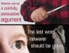
The printable version (4000x3000 pixels) is http://www.olegvolk.net/gallery/albums/arms/proportional6909.jpg
I tried green, gray and yellow, went with the latter because the others lacked visibility.
As for the text, make a mockup of improved text, I'd like to see how it can be done better.
I tried green, gray and yellow, went with the latter because the others lacked visibility.
As for the text, make a mockup of improved text, I'd like to see how it can be done better.
entropy
Member
Perfect right off, Oleg! Nice shotty, BTW!
Feel free to mess with the font or letter coloring as others have suggested, but I believe this is one of the best products you've produced in my time on THR. I've got a great target audience (the modern American female college student) to share your work with. Thanks, and keep it up!!
Joejojoba111
Member
- Joined
- Mar 7, 2005
- Messages
- 1,056
What's reflected in the pupil?
spartacus2002
Member
<----still waiting for Oleg to use Pamela Anderson as a model
As I explained to my wife, it's not an addiction, it's a fetish.
As I explained to my wife, it's not an addiction, it's a fetish.
Very well done. The eyeshot on the lower left softens the harsh goings-on implied to the right.
I work with ugly engineer-crafted Excel & Powerpoint graphics every day. It is nice to see what somebody with an eye for aestetics can do.
Oh, and the sentiment expressed is right-on. I'd much rather comfort my wife after she ventilated some dirtbag than have to ID her at the coroner's office.
I work with ugly engineer-crafted Excel & Powerpoint graphics every day. It is nice to see what somebody with an eye for aestetics can do.
Oh, and the sentiment expressed is right-on. I'd much rather comfort my wife after she ventilated some dirtbag than have to ID her at the coroner's office.
Oleg Volk
Moderator Emeritus
Relection shows the softbox...maybe I should add a silhouette into it. Since my home computer got messed up by lightning earlier today, it may be some time before I can update that graphic.
P95Carry
Moderator Emeritus
Oleg - like it immensely but - wanted to ''play'' a bit - so offer a slight alternative. Like most of these things - there are no finished results that will always be judged perfect - always scope for change!
I painted out the rather large (to me) eye catchlight - and changed wording a tad as well as font ... plenty of other fonts would suit tho. I chose bottom text color as a sample of lightest skin tone of model... the yellow for me was a problem .. too blatant.

I painted out the rather large (to me) eye catchlight - and changed wording a tad as well as font ... plenty of other fonts would suit tho. I chose bottom text color as a sample of lightest skin tone of model... the yellow for me was a problem .. too blatant.
Attachments
MaterDei
Member
Chris' graphics are AWESOME. Much better than the original.
The font doesn't matter as much though.
Good work to both of you.
The font doesn't matter as much though.
Good work to both of you.
Cool Hand Luke 22:36
member
Good poster.
Here's a suggestion for a related one: the hand with the knife and the cuff of the flannel coat is reflected in a very large image of the woman's eye, and the image of her next to it would show her with a phone in her left hand and a .38 snubnose in her right, standing over the torso of the BG in the red flannel coat.
Here's a suggestion for a related one: the hand with the knife and the cuff of the flannel coat is reflected in a very large image of the woman's eye, and the image of her next to it would show her with a phone in her left hand and a .38 snubnose in her right, standing over the torso of the BG in the red flannel coat.
Glocker
Member
love it
- Status
-
Not open for further replies.