Which of Oleg's Images Need to Be on Shirts?

Status
Not open for further replies.
Oleg, you don't want it to be inherently violent at first glance.
At least, not in my take of it.
I'd have to do a bit of poking around and thinking, but I'm sure there's an image out there that at first says "yes, I would like a world without guns" but then gives the reader a realization of the horror that would entail.
 
Thanks bnkrazy, for posting those for me. I chose them because they convey the message quickly, and they focus more on the right to self defense. I think a quick message is the most important for a t-shirt, because people walking by don't want to stop you to let them read your shirt.
 
I can't seem to find it at the moment, but I've always liked the one that says something along the lines of,"Human beings understand decency and respect. Predators understand strength."

http://www.olegvolk.net/gallery/technology/arms/poland3489.jpg.html

http://www.olegvolk.net/gallery/technology/arms/better7364.jpg.html

http://www.olegvolk.net/gallery/technology/arms/yourkid0181.jpg.html

http://www.olegvolk.net/gallery/technology/arms/bears2390.jpg.html

Can't get the pictures to work. Here are the links.
 
I am trying to make the time to re-design some images for brevity and clarity. I want them to be easily readable from ten paces away.
 
Image size is going to be up to 11(ish)x14(ish) for vertical images, and 8.5(ish) x 11(ish) for horizontal (much more, and they're really too large for the shirts. Same basic process that was used for the shirts before, but with some larger images available. Shirts will be Gildan, Jerzees, etc., 6.1 ounce (or eq) 100% cotton, similar to the Hanes Beefy T, but without the donation to the Brady Bunch...
 
if it has more than 10 words, it is too long and wordy for a t-shirt, even 10 words is pushing it.

You shouldn't have to be as close as you are to a computer screen to read it. Judge all pictures and text on those pictures from 10 feet away, even though, yes, it will be bigger on the shirt. It should be readable as someone walks past you on the sidewalk, without them having to stop you, while the shirt moves as you move, wrinkles a bit, etc.

The pregnant lady is good, but the text size should be increased even more on a Tshirt version

"Imagine a World Without Guns" would work with no image, or a much simplified image (imagine a black panther style fist, turned sideways, then mirrored and reduced) and reduce the 'counter text' to just "The strong molest the weak (frail?) with impunity'

Gun Control Doesn't Add Up, would work as a front/back. With the back having a BIG "Gun Control Doesn't Add Up" and the front having the same, say in red, BIG, but overwritten with the stats, smaller and in black, but no percentages, and what's with the green I in front of used and the red . in front of the second used?

A tool like any other could be done with "silouettes" of tools, say 5, with one gun silouette in there also, in a single row across the 'belly' and the title would go across the pecs/breast area

Macht Frei would work, nice image too, but shortened text slightly, and larger.


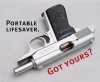
"I will equalize" with a simpler picturer, like with the whole text written right over top the photo of the cap and ball revolver and ammo and powder flask, text in white
 
i have 8 t-shirts with oleg images. none of them are previously pictured in this thread.
 
Well, over the next little bit, we're going to start putting a catalog together.

There might be -limited- editions, but some favorites may stay in the catalog - that's all up to Oleg. They're going on white Gildan, Jerzees or Anvil 6.1 ounce 100% cotton shirts - the nice heavy ones. DO NOT ask me to do a Hanes Beefy T - they gave too much money to Brady.
 
First, I applaud ALL of Oleg's amazing work.

But specifically to work on a t-shirt, other factors must be a high priority. Four color (full color) work is more expensive and may not print well. Designs should be simplified, with very clear borders and transitions. Usually, simpler is better.
 
Great idea

T-shirts .... good. Cute models .... good. Brevity, and clarity .... good.
IMHO, keep the message short, and the drape sublime; i.e. wide range of fit (xs-XXL, think: if the ladies can't wear 'em, they'll still fit the toddlers :D ). Ever though of 50/50 cotton/poly or lighter-weight cotton, for high-speed/ less drag? Ringneck style? "TheHighRoad.org", small letters, on left chest placket, or on left/right arm at cuff of t-shirt? Just some free ideas. The images, nonetheless, are thought-provoking, and your site is A+. Ain't marketing fun?
 
Well, I am going to go through some of his stuff this weekend, and bother him to send stuff that's not up to print-quality...

I'm using a fused pigment process that works pretty well for some pretty decent detail - Travis, you'll like it.

Oleg, I'll try to get 'hold of you sometime, and we can iron out the handshake stuff...

Right now, figuring on the higher quality/heavier 6.1 ounce 100% cotton shirts - the 50/50 ones just don't have as nice a feel to 'em.
 
I can't find it now, but the first of Oleg's images I ever saw is still my favorite. It features a bullet proof vest with the caption "Some vermin wear kevlar. Punch through." With a .308 or something on top.

If anyone has this, please post a link.
 
Status
Not open for further replies.
Back
Top